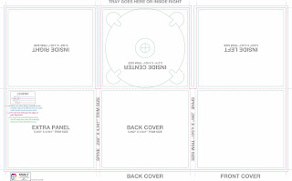
A digipak is patented style of optical disc packaging and typically consist of a book-style paperboard or card outer binding which includes a CD and/or DVD inside. This is an example of how it should look:
How to have a successful digipak:
1) It is unified with the content or message you are trying to get across. This creates an intermediate connection and sense of belonging.
2) Is there an information and visual hierarchy? This means there is a focal point or image that grabs your attention first, and then your eye is led around the design in the order of what is important after seeing the main image or reading the main text.
3) Does the design have a graphic impact? There are many CDs competing with yours for attention so yours must be a major contender.
4) Is it appropriate for when you want to attract an audience and the environment in which it will be presented? A poster or CD for a country audience will not have the same look and feel.
 An example of a iconic logo is the Rolling Stones' which also became their brand and one of the most recognisable symbols of the rock 'n' roll genre. It captures the bands rebellious attitude in pushing sexual and social norms in both their lyrics and their off-stage antics. The golden era of cover art design began in the early to mid 1960s and lasted into the early 1980s. During this time the major format for music was the 12 inch, long play disc or LP. Cover art became a part of the musical culture of the time. Often used to express graphically the musician's artistic intent, it helped connect and communicate to listeners the message or underlying theme of the album.
Designers, photographers and illustrators sometimes became famous for their cover art creations. Such notables as Andy Warhol and Frank Frazetta were taken from being known in their industry to becoming household names due to their cover art graphic design work. So respected and desired are the designs and illustrations found in cover art that there are numerous art galleries that specialize in helping collectors find rare album covers. Designers learned to capture snapshots and portions of the artist's musical intent rather than trying to convey the entire message. Also, designers started conveying the emotion of the music rather than the musical intent.
In the present, CD design is undergoing a true renaissance rather than becoming obsolete in the digital age as many thought it would, graphic design is once again proving itself as the difference maker. The internet is now the largest record store imaginable. Now rather than browsing a few hundred albums or songs at a time you may be exposed to thousands. Since it would be impossible to listen to portions of all those thousands of songs the design of the accompanying artwork must cause potential listeners to stop, take notice and give the album a try.
The Design Process:
- Professionals have processes to assist them creatively. There will be an initial consultation during which lots of questions are asked and most designers use a design brief form. The questions on the form are designed to crystallize and solidify your identity and vision, so you and the designer are clear about it. Both get a copy, and sometimes you will be asked to sign it to approve the accuracy before the concept development production begins.


