This is the final version of my poster and overall, I think that I have successfully portrayed the edgy and modern look that our artist gives.
Although it is a simple design, I wanted to think about it from a consumer's point of view. Something eye-catching colour wise yet promoting the essential information that they would need to know. I used the same photos and colours which I had used for the digipak to give it a clear house style.
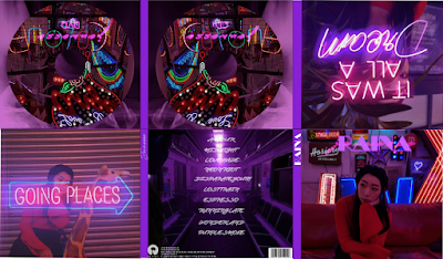
This is my final digipak as well. As I said before about my poster, I aimed for my digipak to stand out in its own way so I stuck to dark images and neon signs to give it contrast.


No comments:
Post a Comment